Product News
Iconik interface updates: New navigation and accessibility improvements coming in March

Published on
February 20, 2026


In this article
When you log into Iconik on March 4th, you'll notice a new color scheme and an updated navigation bar designed to make frequently used pages easier to access. In the coming weeks, we'll also be introducing a grey background across the interface, replacing the current blue.
These changes are the first visible steps in a larger initiative to make Iconik more accessible, easier to use, and visually consistent throughout the platform via a new design system.
We're sharing this news now so the changes don't catch you by surprise. While the interface will look different, your workflows remain unchanged. Your collections, searches, shortcuts, and workflow will remain unchanged.
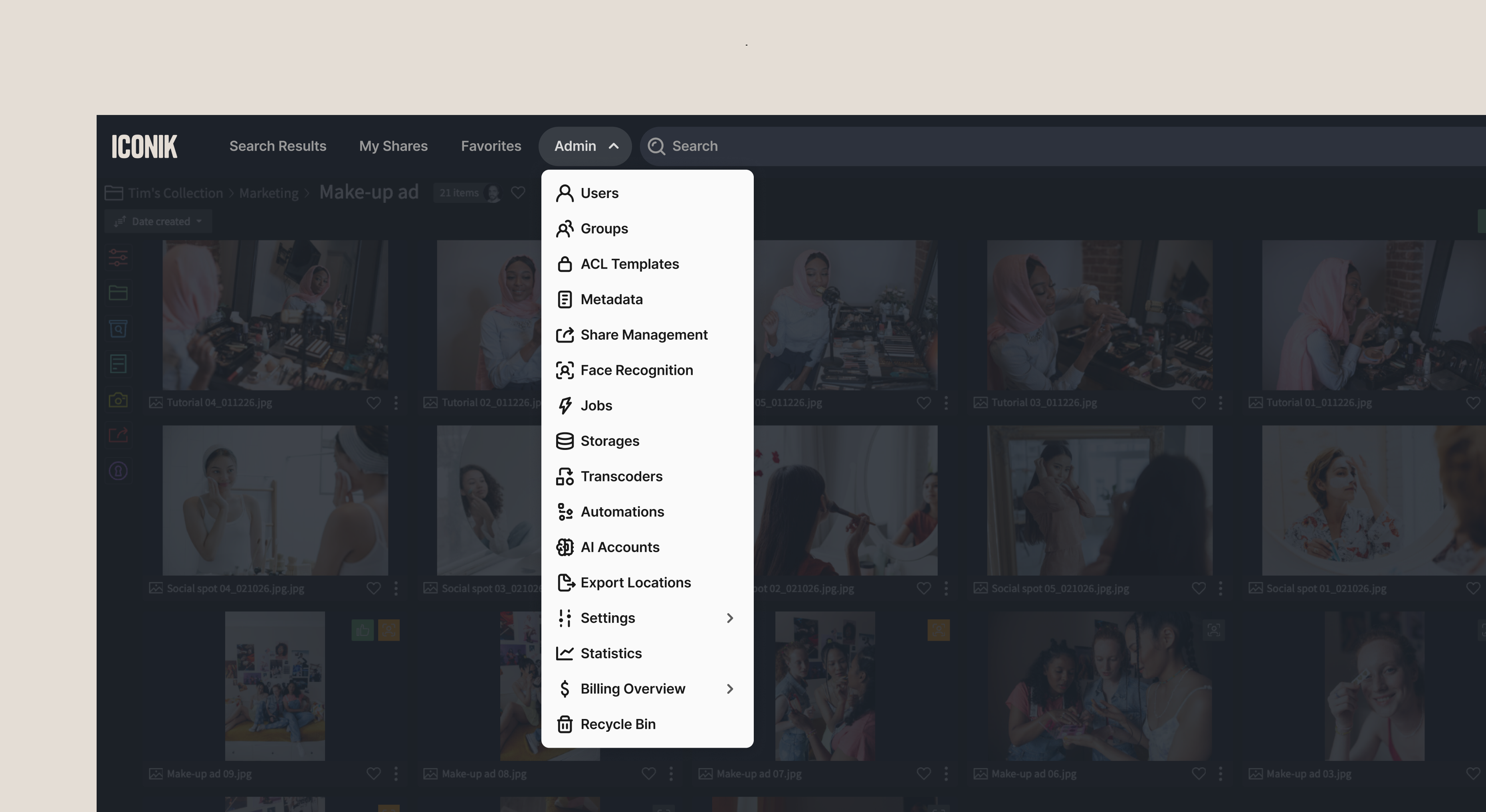
Redesigned navigation bar
The navigation bar is being restructured to reduce clutter and put your most-used pages front and center.
.webp)
What's new:
- My Shares and Favorites now appear in the top navigation for faster access
- Admin dropdown menu consolidates all admin functions (Users, Teams, Transcoders, Settings, etc.) into a single, organized location
- Upload button removed from the top nav — usage data showed most users upload via drag-and-drop, storage connections, or the Iconik Agent rather than the top nav button
- User profile dropdown expanded with easier access to Admin Training and other resources
Why this matters:
These changes reflect how people actually use Iconik. My Shares and Favorites are high-traffic pages that deserve prominent placement. Admin functions are easier to find when they're consolidated. And removing the rarely used Upload button makes room for what people access most.
The result: fewer clicks to reach the pages you use most, and a cleaner, more intuitive interface.
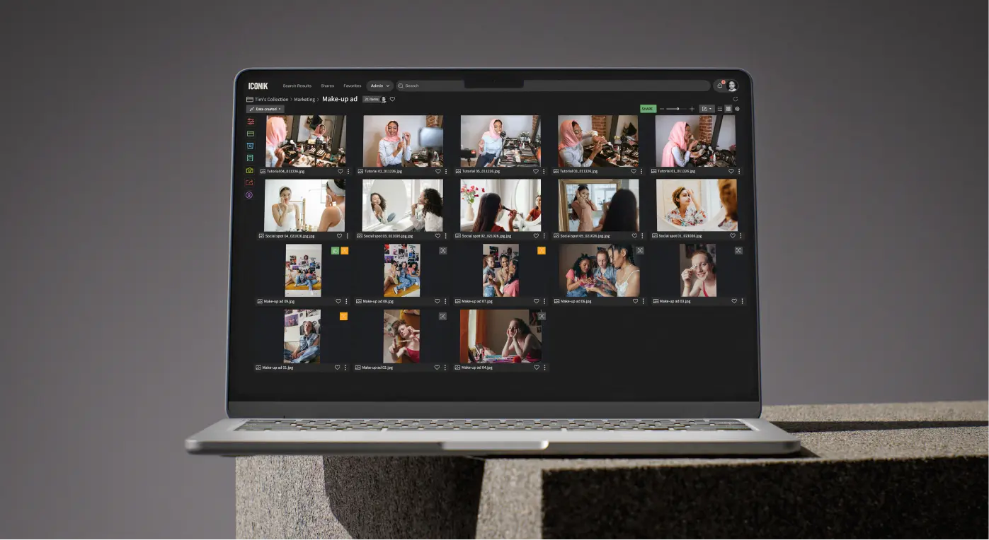
Grey color scheme
In the coming weeks, you'll see a grey background throughout the interface instead of the current blue.
.webp)
What this color change means for you:
- Pure visual change – No workflow disruptions, nothing to relearn
- Better for media review – Neutral grey reduces color interference when viewing content
- Easier on the eyes – Less visual fatigue during long sessions
- Improved accessibility – Better contrast and readability for all users
- Sets up future improvements – Including light/dark theme options
Why grey?
The shift from blue to grey isn't arbitrary. Grey provides a neutral backdrop that lets your media content take center stage. When you're reviewing footage, color grading, or making critical creative decisions, the background color of your interface matters. A colored background can subtly affect your perception of the media you're reviewing.
This is standard across professional video and creative tools for a reason: it lets your content be the focus, not the interface. You'll see your footage more accurately and experience less eye strain during extended review sessions.
.webp)
The bigger picture: Accessibility-focused design updates in 2026
These changes are part of our new design system, built with accessibility and usability at its core and designed to enable a common design language across all our products. The system and its color scheme (based on WCAG 2.1 AAA) is a framework for creating interfaces and components — the buttons, panels, forms, icons, and other UI elements you interact with — that are consistent, accessible, and optimized for professional media workflows.
If you've used Iconik's New Review Experience, you've already seen this design approach in action. That interface was built from the ground up using these accessibility-focused components, resulting in a modern, professional look and feel.
Now we're bringing that same quality and consistency to the rest of Iconik.
The new system is behind both Iconik's navigation redesign and color scheme change, as well as forthcoming UI updates (see below), with accessibility as the primary driver. We're committed to making Iconik work effectively for more users, including those with visual impairments or color sensitivity. The new color scheme will provide better contrast ratios and improved readability across the interface, making text, icons, and controls easier to distinguish.
What to expect throughout 2026
Throughout 2026, we'll roll out additional updates to maintain the same visual quality and consistency across the entire platform through a series of staged transitions. These updates will include:
- Alignment of fonts, font sizes, and icons throughout the interface
- Modernized panels, modal dialogues, and forms
- Unified navigation across the application
- Updated commenting sections and collaboration tools
- Consistent margins, spacing, and visual hierarchy
- The ability to switch between light and dark modes
We'll continue to give you advance notice and keep your workflows intact.
The ultimate goal is a cleaner, more accessible Iconik interface that's easier to navigate and consistent across browsing media, reviewing content, and collaborating with your team.
Questions?
If you have concerns about these updates or encounter any issues, our support team is available at support@iconik.io.
We're committed to making Iconik more accessible and easier to use for everyone without disrupting your workflow. These are important steps in that direction.
Chris McMahon is a Senior Product Marketing Manager at Backlight, specialising in positioning, messaging, and go-to-market strategy for complex SaaS products. He has over a decade of experience helping creative and technical teams understand cloud-based media and collaboration technology, with a background that spans product marketing, content strategy, and editorial leadership. Chris has launched multiple products, built global sales enablement programs, and shaped value narratives for partners including AWS, Google Cloud, and Adobe. He is based on the south coast of the UK.